Examples Parameter Description Typical Settings Results Table
The correlation scan allows you to find items that act very similarly or dissimilarly to each other. There are a number of ways to use this information:
|
|
You can trade sets of similar stocks off each other. If one has good news and breaks out, you can trade closely-correlated stocks to it, knowing that they will move in a similar way very soon thereafter. If you played the stock with the good news directly you might only catch the tail-end of the move, whereas by buying its correlated partners you could catch a much larger part of the move. |
|
|
You can trade dissimilar stocks off each other - if one has good news then you can go short on another, knowing that it should perform contrarily. |
|
|
You can balance your portfolio, making sure that you have a diverse set of items that will not be affected by each other. In this case you select items that are not well-correlated with each other. |
TCScan+ works out correlation coefficients for the items you select compared to a reference item. For example, you could choose the Nasdaq Composite index, COMPQX, and find which items in your list behave most similarly to it. Correlation coefficients are a statistical measure that indicate how closely two curves move in the same way. The correlation coefficient has a value between -1 and +1. Values close to 1 show that the scanned item and reference item behave very similarly, while those close to -1 behave in an opposite manner. Values close to 0 indicate that the two items are not related at all. Click here to see some examples of Correlation scans.
Note that correlation coefficients are not static - they change with time as the nature of the market and its participants change - you will need to update your correlations regularly. Furthermore, stocks may be well-correlated on a short-term basis, but not long-term. It is more probable that items that are well-correlated over a longer period of time will stay so, than they would if they only had a short-term correlation. For this reason we recommend not basing judgments on correlations less than 100 trading days.
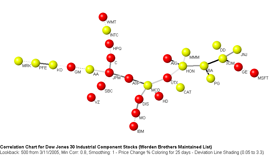
Another valuable feature of the correlation scan is that it enables you to build a map of the market, showing how stocks are related to each other in a graphical manner - you can then quickly see which stocks are best related to which, and how to balance your portfolio. For example, below is a map of the correlation structure for the Dow Jones Industrial component stocks for the 500 trading days prior to 3/11/2005. Stocks linked to each other are highly correlated, and those far apart from each other are much less well-correlated. For this time period a well-balanced portfolio should have included stocks from the ends of the tree, for example, MRK, WMT, JNJ and IBM. On the other hand, someone who was very bullish on Honewell (HON), and wanted to invest in similar movers could have also taken positions in AIG, MMM, BA or UTX.
You can use TCScan+ to construct trees
such as this for your lists, but it would be very laborious,
because it involves calculating correlation coefficients for
every stock in the list, compared to every other
stock. You then have to find the best correlations,
and construct a tree linking the best-correlated stocks to
each other. Luckily, we have created a separate
program, CorrelScan, to do this automatically, and it is available for
free to registered users of TCScan+. The
program has many other features too, including easy trend detection and
classification and can be downloaded from http://www.tcscanplus.com/Download.php.
|
|
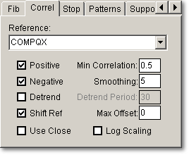
Reference You can select the reference item from the drop-down list, or you can type in any item name, if it is not in the list. The reference does not need to be an index - it can be any item you are interested in. |
|
|
Positive Checking this box will cause TCScan+ to search for positive correlations. |
|
|
Negative Checking this box will cause TCScan+ to search for negative correlations. |
|
|
Detrend Data Checking this box will cause TCScan+ to determine a simple moving average of the data, using the period you enter in 'Detrend Period'. It will then subtract this average from the price to obtain a detrended price curve, i.e., one with the major trends removed. |
|
|
Shift Ref This affects how TCScan+ will plot the reference item on the chart. If this box is checked then the reference item will be plotted shifted over by the best offset found (if Max Offset is not zero). If the box is not checked then the reference item will not be shifted on the plot and will appear the same for all items. |
|
|
Use Close When this is checked, the correlation will be based on the close price rather than the average of the open, high, low and close. |
|
|
Min Correlation The value in this textbox will be used to exclude less well-correlated items from the results. The number is an absolute value so if you entered a value of 0.8 here, for example, then only positive correlations greater than or equal to 0.8 and negative correlations less than or equal to -0.8 will be shown in the results table. |
|
|
Smoothing The value entered in this textbox will be used as the period for a simple moving average, which will then be used in place of the original data for the correlation calculations. |
|
|
Detrend Period The value entered in this textbox will be used as the period for the simple moving average used to detrend the price data. We recommend values greater than 20. |
|
|
Max Offset is the maximum amount of offset to be allowed in the search for the best correlation. The correlation coefficient will be calculated without an offset, and then the reference item data will be shifted forward by 1 day up to the maximum offset amount, one day at a time. For each offset, a correlation coefficient will be calculated and the best correlation and offset for this correlation will be shown in the results table. This allows you to find items that are highly correlated with another, but separated by a time lag - you can then take a position in the lagging item days before it actually starts its move. Note that items that show their best correlation right at the maximum offset, will probably show even better correlations at higher offsets. You should be wary of accepting these correlations until you have increased the maximum offset even further, to find the true optimum offset. |
|
|
Log Scaling
checking this box will cause TCScan+ to use Logarithmic Scaling (instead
of the normal Arithmetic Scaling) for charts. When using logarithmic scaling you will notice
that the price axis numbers on the chart do not increase linearly,
but rather proportionally. |
There aren't any specific guidelines
for the Correlation scan parameters. However, we
suggest you use a Lookback Period of at least 100 trading
days, and only consider correlations higher than around 0.9
or lower than around -0.85. We generally smooth the
data by about 1/20th of the Lookback Period (e.g. 5 days
smoothing for a Lookback Period of 100), and do not use the Detrend
option. ![]()
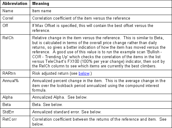
The table below summarizes the headings appearing in
the results table (apart from PTrnd & VTrnd (the price and volume trend) and
the Back-Test statistics.) With so many columns
in the results table for this scan, it is advantageous to switch to Results-Only
mode by pressing the F2 key when viewing the results and then switching back
again to Whole-Form mode to adjust your settings. ![]()
Alpha & Beta versus Correlation Coefficient
Correlation Coefficients are a statistical measure that indicate how closely two curves move in the same way. The correlation coefficient has a value between -1 and +1. Values close to 1 show that the item and reference item behave very similarly, while those close to -1 behave in an opposite manner. Values close to 0 indicate that the two items are not related at all. See Examples.
Alpha, Beta, Standard Error and Risk Adjusted Return are all derived from a plot of the daily returns of the item versus the reference. The daily return is the daily change in the item or reference and is calculated in two different ways depending on whether you have the 'Log Scaling' box checked on the Correlation tab:
Arithmetic Return: Pi+1/Pi-1
Logarithmic Return: Log(Pi+1/Pi)
Where Pi+1 is the current day's price and Pi is the price a day earlier. The price used is either the close or the average of the open, high, low and close, depending on whether you have checked the Use Close box.
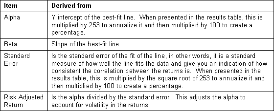
The daily returns of the item are plotted versus the reference and a best-fit straight line is drawn through them. The alpha, beta, standard error and risk adjusted return are determined from the best-fit line as follows:
As an example, the chart below shows the daily returns of MRVL plotted against those of QQQQ. By plotted against, we mean on a particular day the daily return of QQQQ is measured along the horizontal axis and then the daily return of MRVL is plotted vertically from there. For example, consider the yellow-highlighted point near the top right of the chart. This shows a day where MRVL increased by about 5.6% from the previous day, while QQQQ increased by around 2.6%. This is done for all the days in your lookback period.
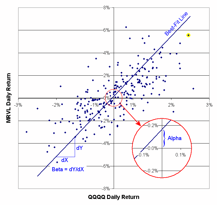
You can see that, on average, MRVL has larger daily changes than QQQQ does. This is illustrated by the slope of the line or Beta, which for the time period shown is 3.53. This means that, on average, the daily return of MRVL is 3.53 times the daily return of QQQQ. In contrast, Alpha is the Y intercept of the best-fit line, and estimates how much MRVL would change on a day when the QQQQ was flat (because it is the position of the best-fit line when the QQQQ return is 0.) In other words, alpha is the excess return of MRVL over the QQQQ or, how much extra daily income you could expect by investing in MRVL versus QQQQ. In this case the alpha is 0.17%, which annualizes to 41.9% (as would be shown in the results table.)
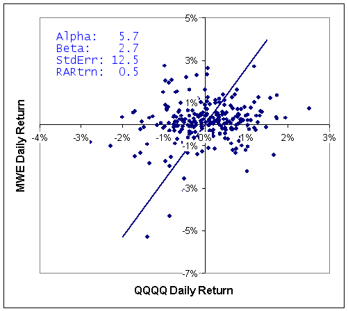
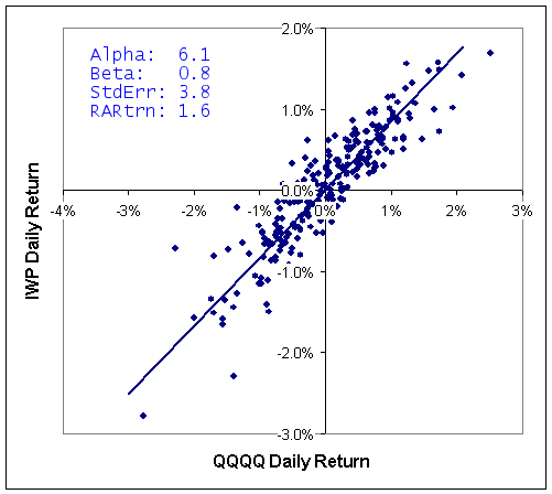
One more item is needed, however, to make a better investment decision. Consider the two returns plots below for MWE and IWP versus QQQQ. Both stocks provide a similar alpha over this time frame and MWE has a higher Beta, so tends to change in larger increments than IWP. However, looking at the left chart, you see that the points are a lot more scattered around the line than on the right chart. The scatter means that there is a lower chance that MWE will provide returns consistent with the best-fit line than IWP will. This is reflected in the standard error numbers: MWE's is 12.5% and IWP's is 3.8% and shows that MWE would be a more risky investment than IWP. Instead of looking at alpha, therefore, it is better to look at the risk adjusted return, which is alpha adjusted for the standard error. In this case, you can see that IWP offers a risk adjusted return of 1.6 versus 0.5 for MWE.
